

ScoreMe has unveiled a comprehensive brand refresh aimed at strengthening its market presence and improving customer recall. The rebranding reflects the company’s continued evolution as it aligns its identity with innovation, reliability, and a user-first approach.
Operating in an increasingly competitive FinTech landscape, ScoreMe’s refreshed identity is designed to reinforce visibility and deepen engagement with its core stakeholders. The updated brand framework brings together three defining pillars, Aesthetics, User Centricity, and Brand Values, into a cohesive visual and strategic narrative that feels both familiar and future-ready.
Shashank Sharma, Co-founder & Director, ScoreMe Solutions, said the rebranding goes beyond a cosmetic update. He noted that the initiative reaffirms the company’s commitment to delivering innovative credit solutions with clarity and confidence. According to him, the refreshed identity is crafted to help ScoreMe stand out in a crowded market while remaining rooted in its foundational principles of trust and technological excellence.
As ScoreMe expands its footprint in the AI-powered credit analytics space, the new identity marks a milestone in its journey toward becoming a more recognisable and influential industry player. The redesigned logo, updated colour palette, and refined typography collectively represent the company’s emphasis on stability, innovation, and long-term trust.
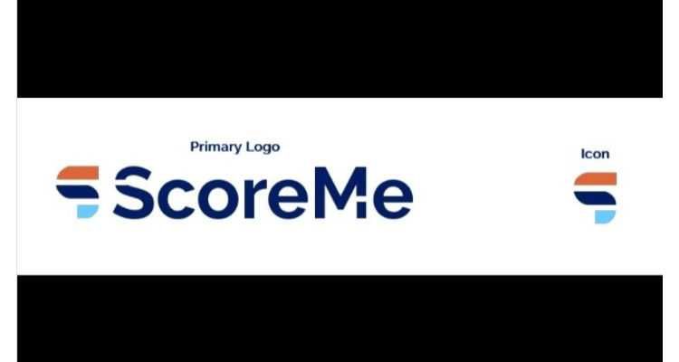
At the centre of the transformation is a reimagined logo built around the letter “S,” symbolising the brand’s essence. The upward extension of the letter represents forward momentum and innovation, while the bold blue typography conveys strength and dependability. A vibrant touch of orange introduces energy and dynamism, underscoring the company’s progressive outlook.
The brand now adopts the Raleway typeface, known for its clean geometric structure, balancing professionalism with modern appeal. The thoughtful use of upper- and lower-case letters reflects both industry experience and a fresh, adaptable mindset suited to evolving digital ecosystems.
Colour continues to play a strategic role in the refreshed identity. Orange communicates enthusiasm, positivity, and a sense of security. Navy blue reinforces reliability and expertise, while light blue conveys clarity and wisdom. The deep navy treatment of the brand name anchors the identity in trust, an essential attribute in the FinTech and lending ecosystem.
With this strategic brand overhaul, ScoreMe positions itself to enhance recognition, build stronger connections with financial institutions, and reinforce its standing as a technology-driven partner in digital credit transformation.
Send news announcements/press releases to:
editor@thefoundermedia.com


